Strivelle
A complete product redesign transforming Bravera's running rewards platform into a clean, modern experience. Connect Strava, earn points per kilometre, and redeem real rewards at local venues.
Role
Lead Product Designer
Client
Gone Runner
Tools
Figma, Protopie, Next.js
Type
Mobile App · Product Redesign
Year
2025 – 2026
Insights
Findings
Early findings were clear: reward redemption needed to be fully digital and frictionless in busy partner environments. Anything requiring manual steps or staff training would break adoption at the point of sale.
Results
Through iterative ideation and prioritization, the strongest direction emerged: simplify core flows, open clearer communication between runners and partners, and focus on community-driven motivation rather than generic one-size-fits-all advice features.
Customers wanted richer progress insights and practical guidance, but fully automated advice conflicted with the trusted, human side of community coaching and partner engagement.
Successive rounds of concept testing surfaced a recurring theme: additional digital communication touchpoints were essential, while community interaction and challenge-based participation created meaningful long-term value.
After prioritization, the product direction became clear. Runners valued credible community context and partner-backed experiences, while lower-impact utility features were intentionally deprioritized to keep the product focused and professional.
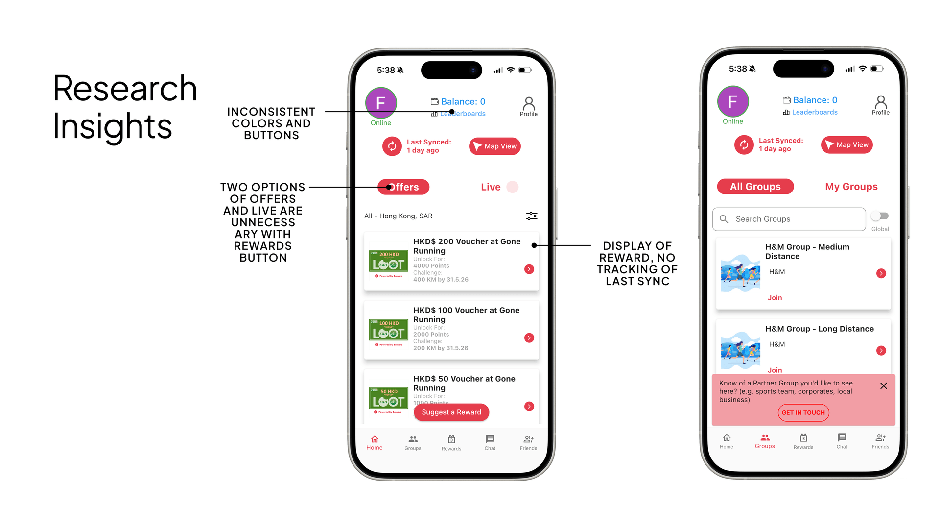
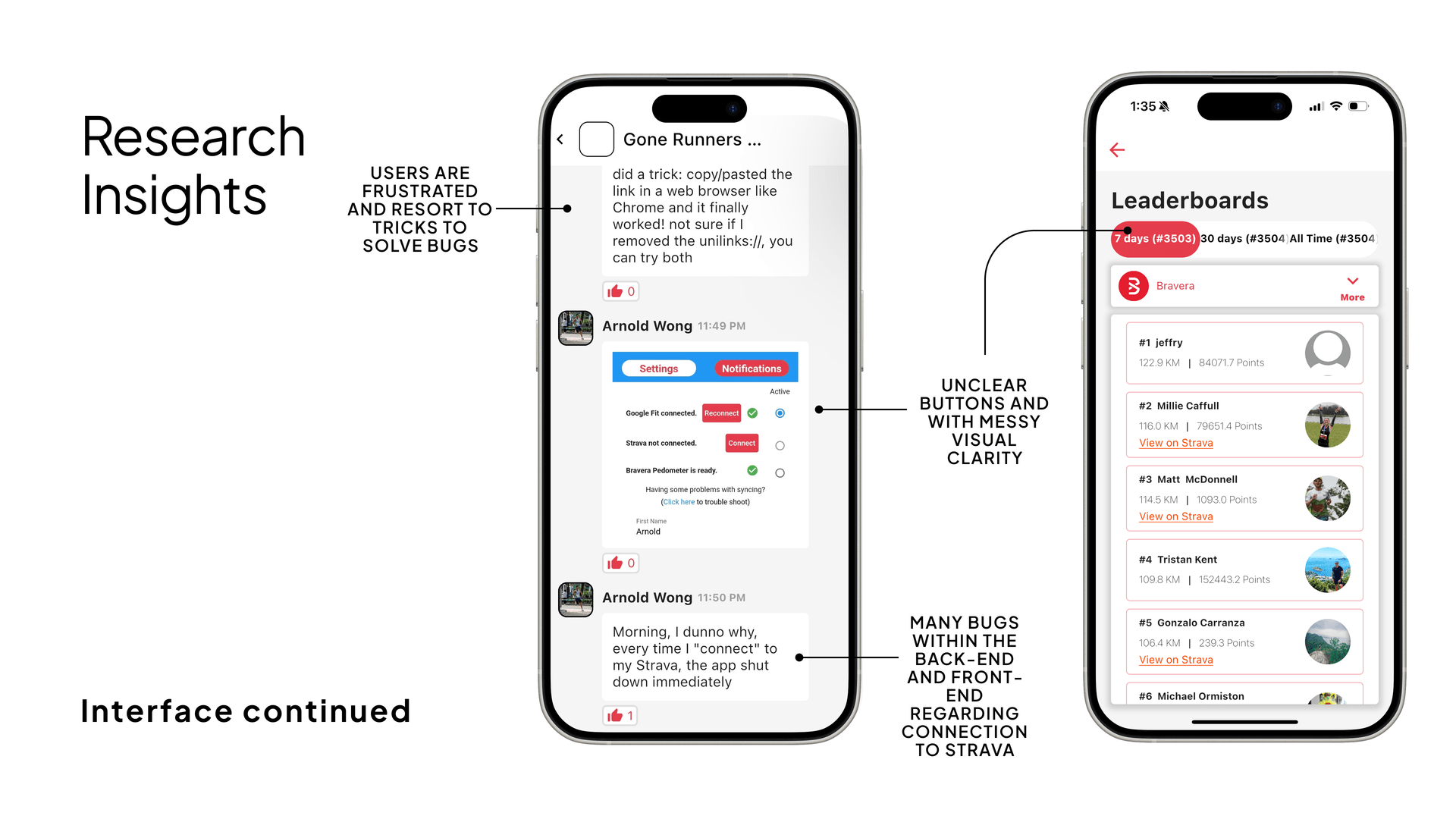
PROBLEM
Bravera's existing app suffered from an inconsistent visual language — clashing red/green colours, cluttered layouts, and unclear information hierarchy. Runners struggled to understand their progress, discover rewards, or engage with the platform's core value loop.
SOLUTION
Strivelle is a ground-up redesign that introduces a cohesive design system, clear information architecture, and a streamlined user flow from syncing activity to redeeming rewards.
Design System
Unified black/white/orange palette replacing the inconsistent red/green
Information Hierarchy
Points and stats surfaced as primary dashboard metrics
Reward Discovery
Partner-branded cards with clear earning paths and challenge mechanics
Target Audience & Partners
Strivelle was designed for both runners seeking motivation and local business partners looking to engage the running community. Understanding the unique needs of each audience was critical to crafting a seamless, rewarding experience.
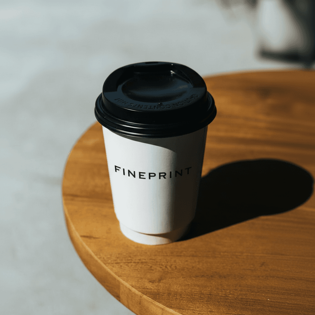
Fineprint Coffee
A bustling specialty coffee shop in Hong Kong, Fineprint is a hub for runners and locals alike, offering a welcoming space and quality coffee.
- Pain Point: Staff need to redeem rewards quickly during busy hours, with no time for training or confusion.
- Design Consideration: Redemption flow must be fast, intuitive, and require minimal taps or explanation.

Fineprint Employee
Baristas and staff at Fineprint are often multitasking and need to process redemptions with zero friction.
- Pain Point: No time for onboarding or app training; UI must be self-explanatory.
- Design Consideration: Use clear icons, large buttons, and instant feedback to make redemptions effortless.
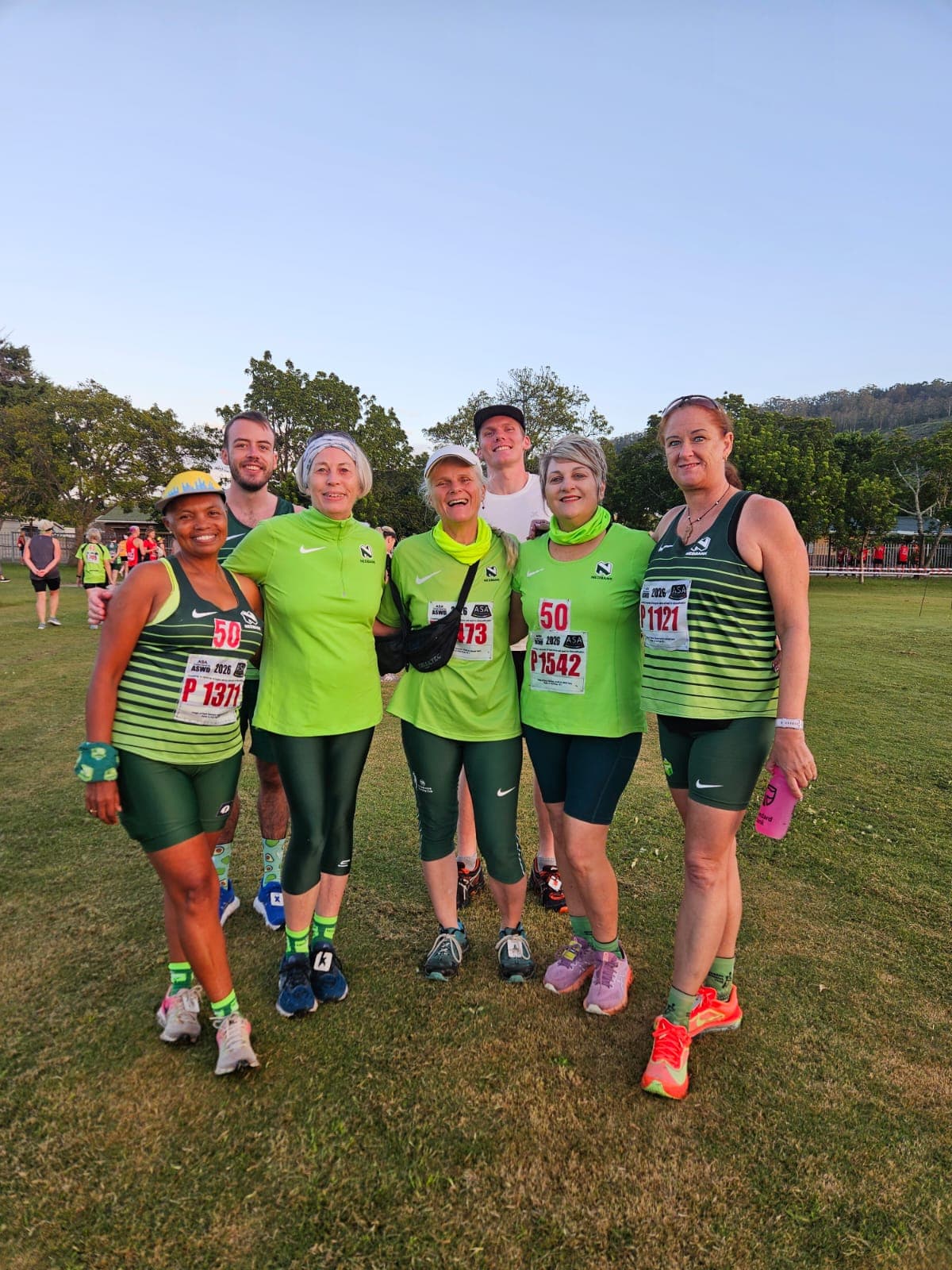
Gone Running
A community-driven run club and specialty running shop, Gone Running uses Strivelle to reward members for both in-store and partner activity.
- Pain Point: Members want to redeem rewards at both Gone Running and Fineprint, with a unified, simple process.
- Design Consideration: Ensure cross-partner redemptions are seamless, with clear reward status and no confusion about where or how to redeem.
Product Design Process & UX Strategy
As sole product designer, I led Strivelle from concept to launch, aligning UX decisions with business goals and delivery constraints.
Workstreams are summarized in STAR format for clear business and design communication.
Holistic Product Thinking: Situation: the legacy experience was fragmented. Task: define a clear product direction. Action: mapped journeys and prioritized features by user and business value. Result: delivered a focused roadmap with clearer sequencing.
UX Research & Validation: Situation: partner and runner needs were misaligned. Task: identify friction and validate assumptions. Action: ran interviews, competitor review, and usability tests. Result: identified priority pain points that shaped IA and interaction patterns.
Iterative Design Process: Situation: early concepts lacked consistency. Task: create a coherent UI system and testable flows. Action: built wireframes, reusable components, and prototypes with engineering. Result: reduced ambiguity and improved implementation quality.
Problem Solving: Situation: onboarding and redemption flows were complex across roles. Task: simplify key journeys for runners and staff. Action: reduced steps and clarified real-time feedback. Result: delivered a faster, more reliable point-of-use experience.
Business & Technical Alignment: Situation: ambitious goals had technical limits. Task: align scope with a practical release plan. Action: prioritized by impact, feasibility, and partner readiness. Result: shipped a scalable direction supporting UX quality and growth.
Wireframes & User Testing
I mapped core flows with early wireframes, then validated them through iterative testing. Findings from navigation and hierarchy pain points were translated into targeted UI refinements to improve clarity, speed, and confidence for both runners and partners.
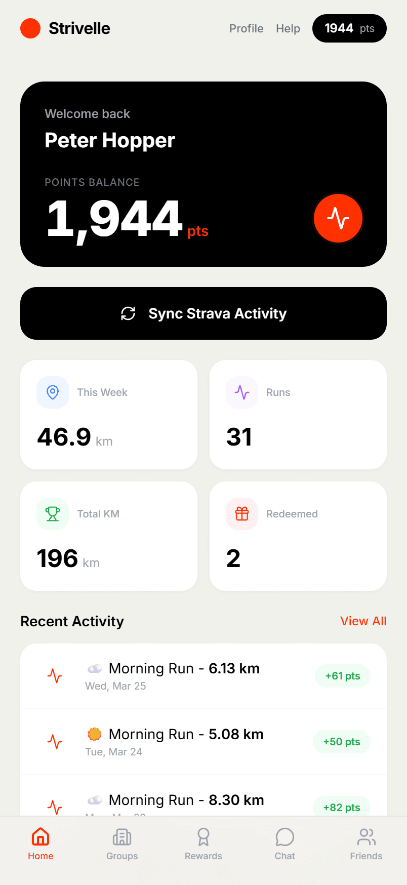
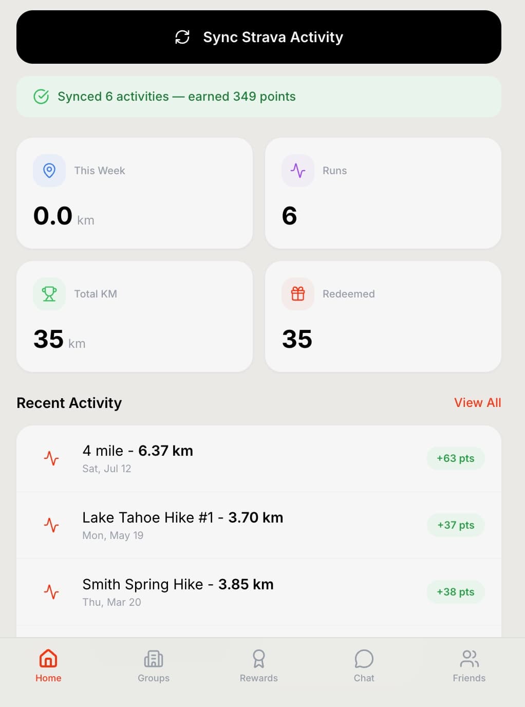
FINAL STRIVELLE REDESIGN
The polished Strivelle interface after the redesign, focused on clarity, consistency, and engagement
Strivelle After
Visual System
Replaced clashing red/green with a restrained black, white, and Strava orange palette that creates visual calm and clear hierarchy.
Information Density
Reduced cognitive load by surfacing only the most critical stats — points, distance, runs — in scannable card layouts.
Navigation
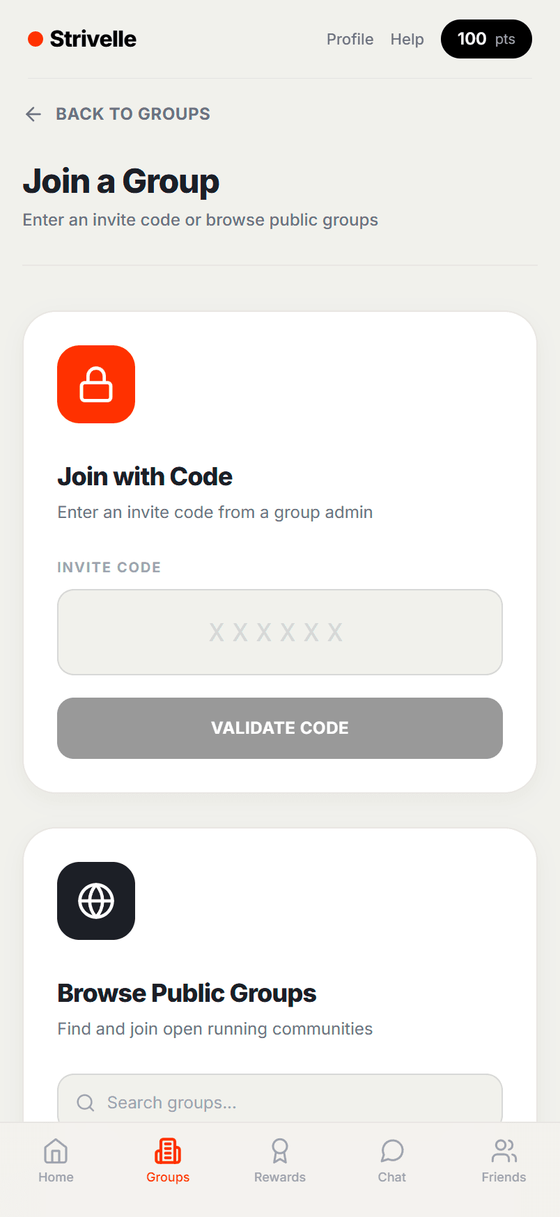
Restructured bottom tabs (Home, Groups, Rewards, Chat, Friends) with clear icons and active states for single-hand use.
KEY SCREENS
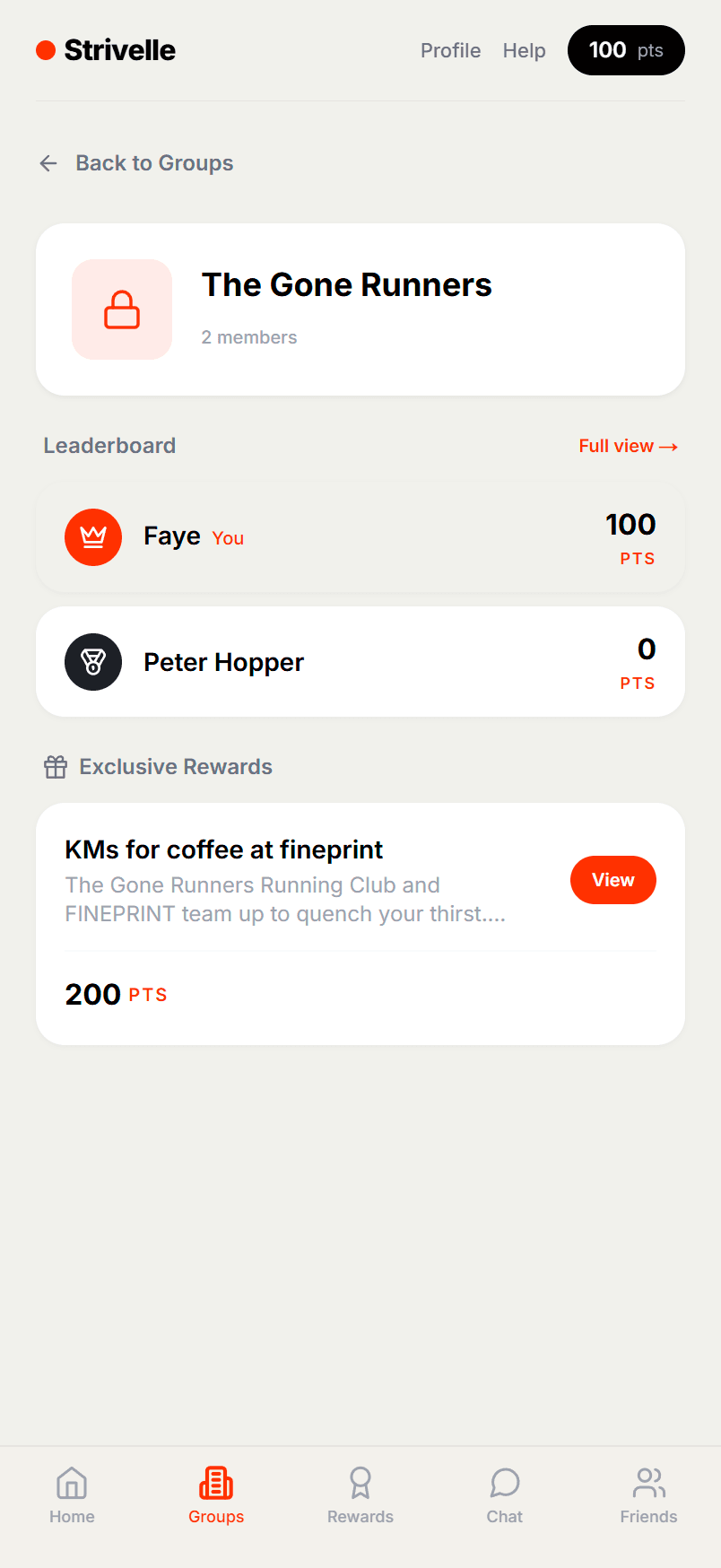

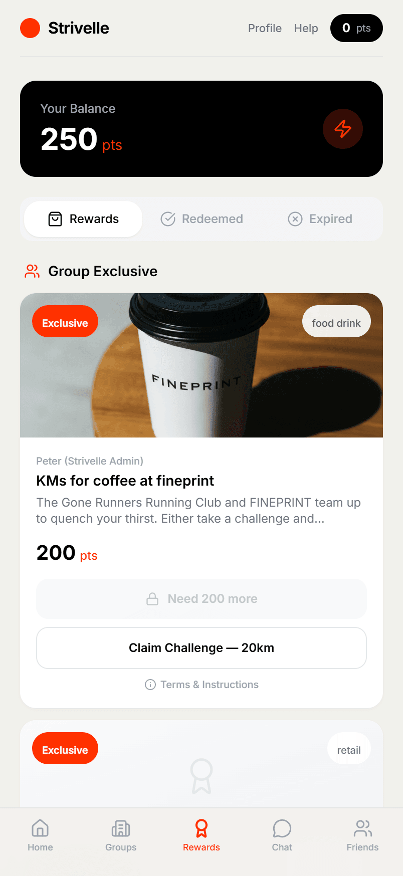
Rewards
The rewards screen organises offers into clear categories — available, redeemed, and expired. Group-exclusive partner rewards like FINEPRINT coffee create tangible incentives tied to running challenges.
Tab-based filtering (Rewards / Redeemed / Expired)
Partner branding with lifestyle imagery builds trust
Dual unlock paths — points or distance challenges
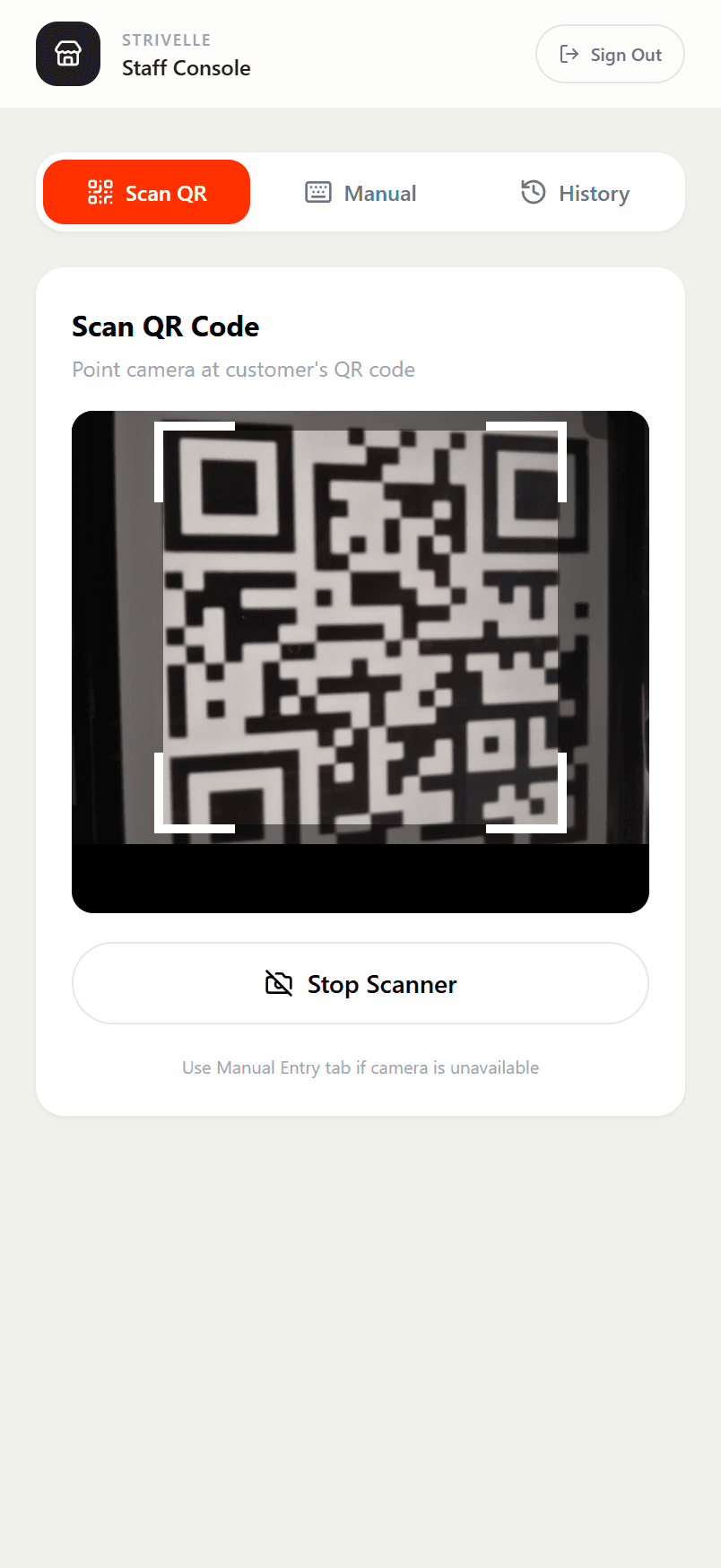
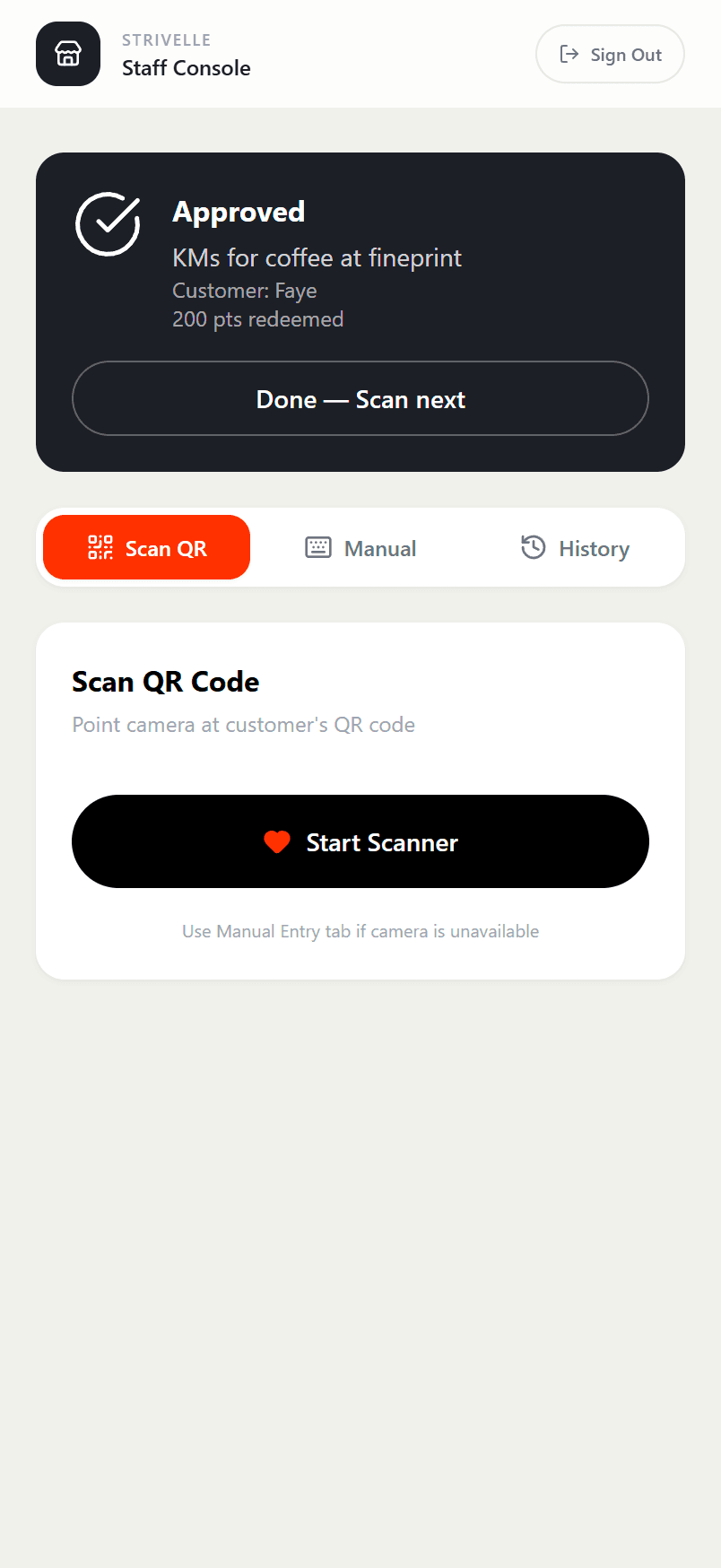
QR CODE REDEMPTION
To redeem a reward, the runner presents their unique QR code in the Strivelle app. The partner scans this code using their own Strivelle partner app, which directs them to the /partnerqr page. This instantly verifies the reward and completes the redemption process securely.
Full partner branding with image carousel
“Unlock with points” and “Take Challenge” dual CTAs
Transparent cost display with balance indicator
DESIGN DECISIONS
Color
Bravera's red and green created visual noise and accessibility issues. The new system uses black and white as a foundation with Strava orange (#FC4C02) as the sole accent colour — reserved for CTAs, active navigation states, and points indicators.
Typography
Bold weights for numerical data (points, distance, runs) create instant scannability. A clean sans-serif hierarchy ensures readability at all sizes, from dashboard metrics to reward card details.
Cards
Every surface uses rounded card containers with subtle shadows and generous padding. This creates consistent visual rhythm and clear content boundaries across dashboard stats, activity feeds, and reward listings.
Interaction
QR code redemption at point-of-sale removes friction. One-tap Strava sync means the earning loop requires zero effort after setup. Challenge-based rewards add a gamification layer beyond simple point spending.
BEYOND CONSUMERS
Strivelle extends beyond individual runners with two B2B offerings
Corporate
Team Engagement
Private running groups with custom challenges and exclusive partner rewards. Companies invite their teams — Strivelle manages everything.
Partners
Local Businesses
Connecting local businesses with active runners to grow their customer base. All partnerships managed directly by Strivelle — zero overhead for venues.